Ultimate Guide to Scrum and Kanban Reports for Trello
Corrello
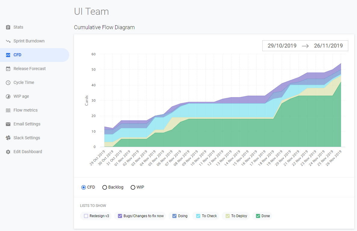
One of the first 3rd party Power-Ups ever launched in Trello, Corrello is targeted at Scrum and Kanban teams using Trello. Dashboards can be viewed within Trello or on getcorrello.com. After adding the Power-Up you let them know some details about how your Boards work (ie which are your backlog, in progress and done lists, and when your Sprints start/end etc.) Corrello will then load the history for your Boards and display all the typical charts used by Scrum or Kanban teams. You can report on one or more Boards in the same dashboard, and add multiple dashboards if you have multiple teams to work with. There is plenty of interaction so you can drill down into your Cycle Time list and get details of Cycle time for each card etc. There are also daily and weekly email and Slack reports so you can keep up to date without having to log in to the tool, invaluable for busy managers and teams.
Corrello has an easy to use navigation on the left where you can select each chart type you might be interested in
- Stats
- Sprint Burndown (if you are using one)
- CFD
- Release Forecast
- Cycle Time
- WIP Age
There are also some additional options for setting up Email and Slack reports.
Some of those views then have additional tabs, i.e. for viewing past burndowns or to see different views of the cycle time data as a control chart or a histogram. One of the innovative charts is the WIP Age chart which shows cycle times for Cards currently in progress vs past averages. In this way you can spot in progress cards which are likely to be over the 80% or 90% cycle time and get them moving again before they become a problem.
For teams using Story Points Corrello integrates with the popular (Free) Agile Tools power-up.
Pricing starts at $5/member monthly

Swimlanes
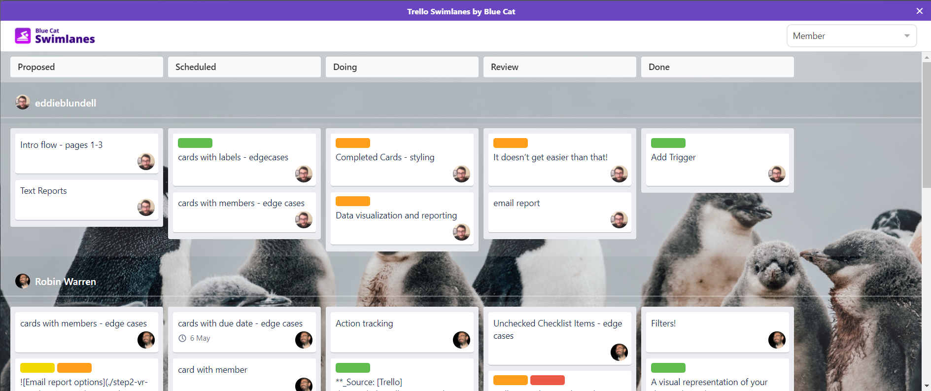
Swimlanes is a simple but powerful way to view your Trello boards. This free power-up lets you split your board up by assigned member, label or custom field. Especially popular for Agile teams so they can see how different work streams are spread across their boards. If you use custom fields to tag cards applying to different epics, or labels to highlight urgent work Swimlanes could be to tool you need to get a clear overview of where everything is on your Trello board.
Dashboards by Screenful
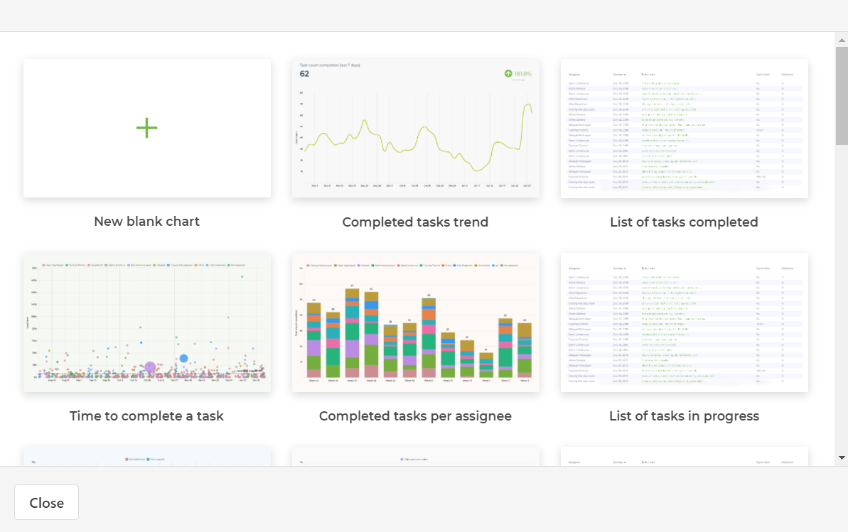
Screenful is split into 5 areas
- Analytics
- Dashboards
- Sprints
- Charts
- Reports
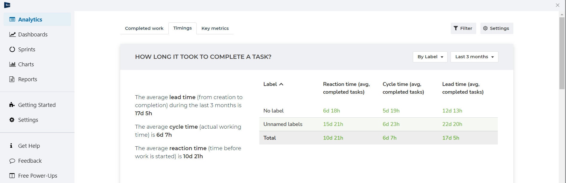
The analytics view shows some nice data on some key metrics they think you might be interested in, lead times, completed work etc.
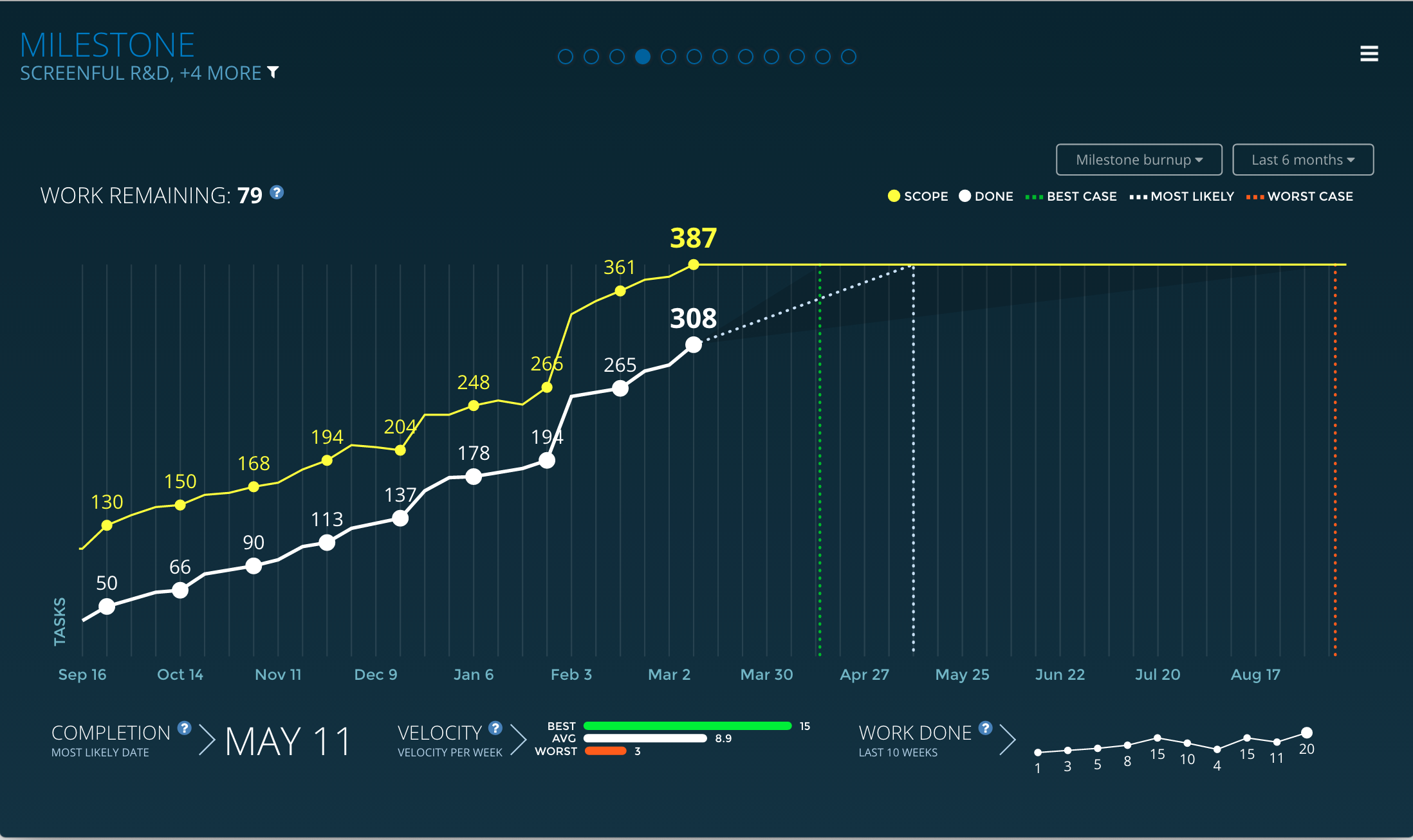
The dashboards are a way to put auto-updating charts up on a large screen in your office, such as the release burnup at the top of this review. The charts displayed can be selected and configured from those mentioned below.
The Sprints area is where you access Screenful’s agile reporting. This covers a lot of the charts an Agile Team would expect such as Burndown, Lead/Cycle Times, Release Forecasting, CFDs etc.
The Charts section lets you create some nice custom charts, or select from their pre configured ones. These charts can then be viewed one at a time from within this area. The filtering options all use Screenful data fields you can set on your cards.
The Reports section lets you include the charts you created above and share/export them. Including the ability to send these by email.
Screenful also has a number of other power-ups for Epic tracking etc. which their dashboards integrate with. If you are using those, or if you are using Sprints it is worth taking a look at Screenful for your agile metrics. For general Trello reporting they have some nice capabilities (especially the scheduled email reports), however if you are looking for more flexible reporting options check out our Flexible Trello Reporting Tools section.
There is no free tier, but after creating an account you can start a 21 day free trial. Pricing starts at $39/month and increases as you add more custom charts and reports.
Kanban Analytics by Nave
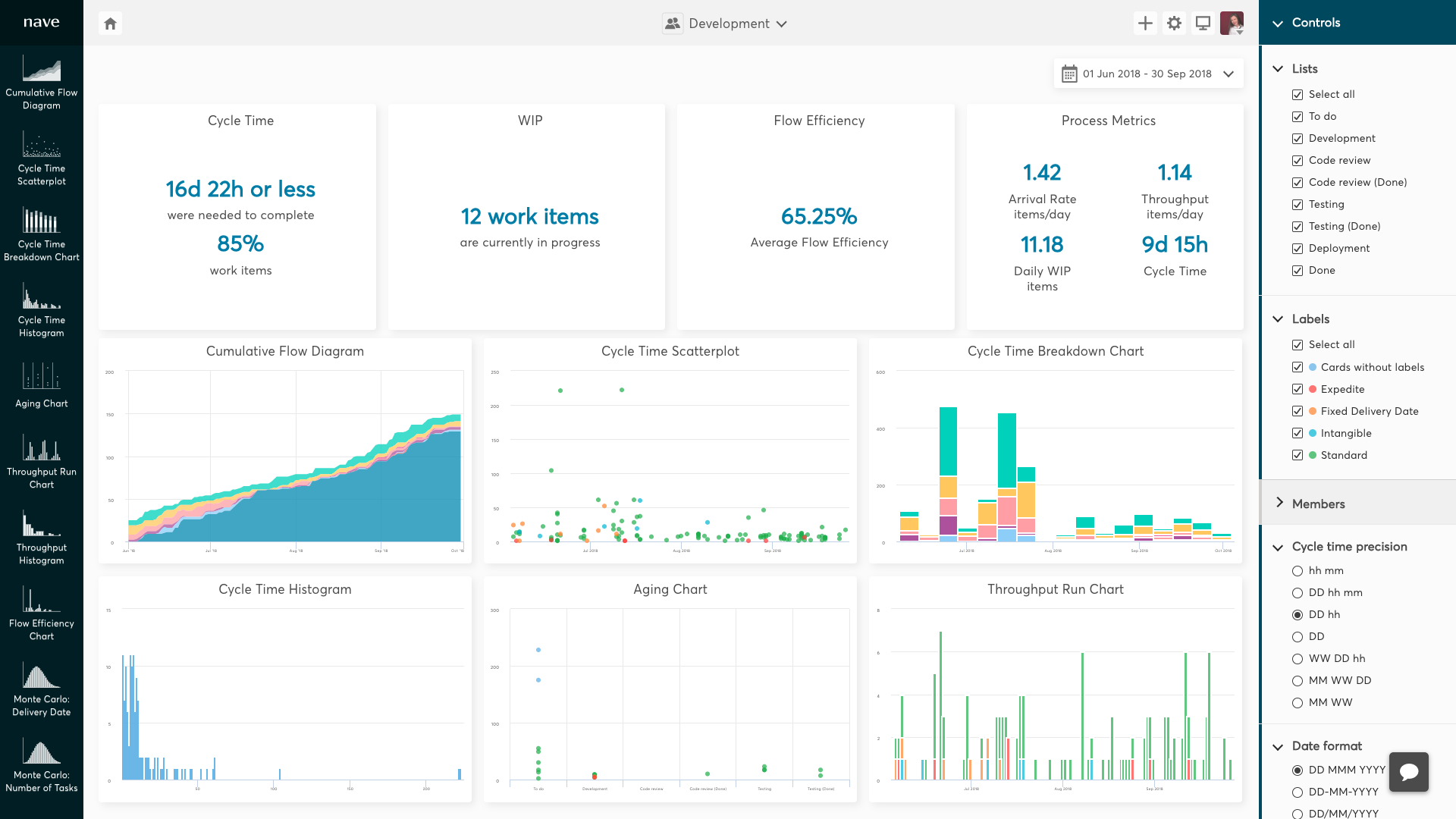
Nave is a solid product for Kanban Teams taking their metrics seriously. Set up is super easy and they’ve got all the charts a Kanban team would be likely to look for. For any Board you add this to (no multi board reporting) you can Analyze work in progress, measure lead times and cycle times, make data-driven forecasts, evaluate workflow efficiency. The reports are opened directly within Trello.
The home screen is an overview of all your charts for the current Board, these can be customised a bit and there are filters on the right hand side to control what is shown. Each chart is then accessed from the menu on the left. They include the ability to display all your charts on a screen in your office.
In all, Nave offers Kanban teams a solid reporting tool. Some may find the level of control off putting, others may like the ability to see (for example) 6 different percentiles for their cycletime charts. Some of the controls seem unnecessary, such as setting your date format etc. And although having the additional data for each chart is great (i.e. process metrics and arrival/throughput rate for CFDs) on smaller screens these charts can end up overlaying the data you are trying to look at. You can easily turn off these additional charts so it’s not a problem, but may become frustrating to some.
The only other potential (small) negative is that you can not set up reports over multiple boards. For most Kanban teams that is going to be 100% fine I would think, but worth noting if that is something you care about.
All in all a solid product for data driven Kanban teams, with some niggles in the user interface, but nothing to stop you signing up if it gives you what you want :)
Pricing is based on the number of Boards you select to report on and starts at $49/month for 2 Boards.