A Time to Complete chart shows how long it took to complete the Cards on your Board as well as the median time to complete for each each group of Cards. See below for how Cards can be grouped in these charts.
To create a Time to Complete chart:
-
Create a new chart.
-
Select "Time to Complete Chart" from the menu options.
-
Select your chart width preference. This is how much space your chart will take up on your dashboard.
- 1/2 width tile = the chart will take up 1/2 the row (ie. you could fit 2 across)
- 3/4 width tile = the chart will take up 3/4 of the row
- Full width tile = the chart will take up the entire row
-
Select which Board you would like to report on.
-
Next you can select how to group your data. This will allow you to group your data for display based on what you are using in your Board. Below are some examples.
- Labels - this will group your data based on Labels assigned to Cards.
- Member - this will group the data by team members.
- Custom Fields - this will group your data by the custom fields you are using on your Boards.
- Note: Only checkbox, dropdown and text options are available for data grouping.
-
Now you must select your In Progress List and your Done List.
- In Progress List - the List where we will start tracking Card movement time from.
- Done List - where Cards are moved to when they are considered complete.
-
Now you can choose to apply a filter. Filters can also be applied after the report is created.
Note: Usually Charts showing Completed Cards to have no filter as you would want to see all Completed Cards. If that isn't the case go ahead an add a filter here!
- No filter - this will show all Cards on your Board.
- Filter - you will be able to select the data you'd like to see from your Board.
-
Give your chart a name. Hit "Continue" or press enter.
After you're finished...
Once you're chart is complete you can do the following:
-
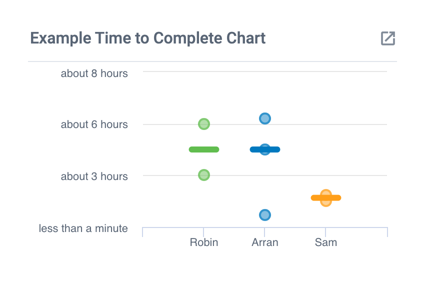
The bar shown in each column represents the median for that specified column. The median is the middle data point of all the time to complete values if laid out in numerical order.
-
Hover your mouse over the dots on the chart to show the time to complete for each individual Card.
-
Drag and drop this chart tile anywhere you like within your dashboard.
-
Drill down (by clicking on the chart) and see full details of completed Cards and the time they took.
Note: Drilldowns are only available once you click 'Done' in the top right.
-
Change the timeframe for display.
- From the bottom right corner of the chart, click on the dropdown menu to select which timeframe you would like to view.


