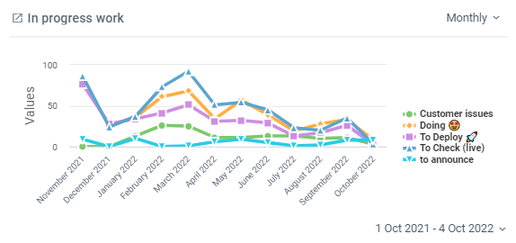
A Historical chart will show you data over time. This can be useful to identify trends or show progress over a specified time frame.
To create a Historical chart:

- Create a new chart.
- Select "Historical Chart" from the menu options.
- Select your chart width preference. This is how much space your chart will take up on your dashboard.
- 1/2 width tile = the chart will take up 1/2 the row (ie. you could fit 2 across)
- 3/4 width tile = the chart will take up 3/4 of the row
- Full width tile = the chart will take up the entire row
- You can now select which types of Cards you would like to show in your chart.
- Open Cards - all those Cards from your Board that are visible. This includes completed Cards as well.
- Completed Cards - all Cards on your Board that have been moved to your "Done" List(s). This will create an additional step where you select your "Done" List(s).
- Cards Added to Board - this is all Cards added to your Board.
- Select which Board or Boards you would like to report on.
- Next you can select to plot a single line on your chart or a separate line for each option in the grouping. Select None for a single line or one of the other options to show multiple lines.
- Now you must select how to total your data. There are several options
- Cards - count the number of Cards.
- Sum - sum a custom field value. This will be useful for numerical custom fields only.
- Average - average a custom field value. This will be useful for numerical custom fields only.
- Now you can choose to apply a filter. Filters can also be applied after the report is created.
Note: If you have selected to report on Completed Cards we recommend the "No Filter" option as a default.
If you have selected to report on Open Cards, we recommend using a filter and filtering by List at a minimum.- No filter - this will show all Cards on your Board.
- Filter - you will be able to select the data you'd like to see in your report.
- Give your chart a name. Hit the "Save" button, or press enter.
After you're finished...
Once you're chart is complete you can do the following:
- Hover your mouse over different parts of the chart to show further details on your specified data.
- Drag and drop this chart tile anywhere you like within your dashboard.
- Change the period for display (daily, weekly, monthly, yearly)
- Change the date range to display


