Using cycle time and a cumulative flow diagram to get more work done by eliminating the bottlenecks in your process
Today I want to share something successful teams do to improve their process and get more work done, delivering projects on time and making their clients and bosses happier :). You don't need to be using Corrello to benefit from this post but you will need to know your cycle times and have a CFD for your process. If you're using Trello why not get a 14 day free trial of Corrello and check out your numbers.
We will be looking at two things in Corrello, the cumulative flow diagram and the cycle time numbers. What we are looking for is bottlenecks in your process. Once you have a good idea of where they are I will show you how to communicate them to your team so they can see and fix them.
First stop - Cycle time stats
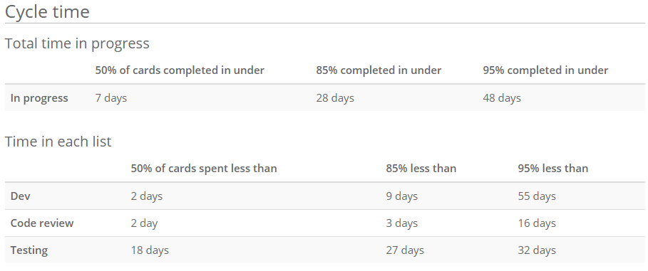
Here we see the cycle time stats for a pretty typical development team where tasks are coded, code reviewed, tested and then moved to done.

The numbers we are interested in here are in the second table showing the time spent in each list. If you don’t currently split your in progress lists up for each step in your process you may want to make the change so you can get this information.
We will focus on the code review column here which shows that
- 50% of the time we code review a card in 2 days or less
- 85% of the time it takes 3 days or less
- 95% of the time it takes up to 16 days!
The question to ask is when we spend 2 days or more in code review, is that because we’re being super careful about code quality and making sure everything is perfect? Or, is it because cards are waiting to be code reviewed for 2 days before someone finally takes the time to check it over? I think we all know the answer. Asking your team will likely elicit the same response. We are all in the business of delivering working code to our customers, so something which has been started already should be pushed through the system before we start something new. Task your team with getting this number down and you will see your whole process improve as cards a delivered sooner.
Obviously the list or lists you will choose to focus on will be unique to you. I would only suggest picking one and tasking your team with improving that before tackling the next one. Rather than risk weighing them down with multiple improvements all at once.
Second place to look - the Cumulative Flow Diagram
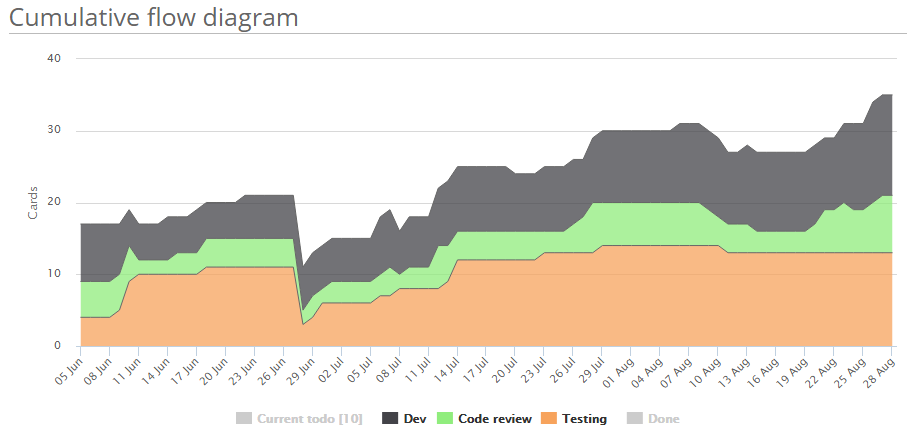
Here we have the cumulative flow diagram for the same team, currently only showing the work in progress lists.

What we can see here are the same details we have above but without the specifics about how long cards are spending in these lists. We can see that the code review list generally has 3 to 5 cards in it each day. That means 3 to 5 cards were in the list for at least one day. If we were to drive down the amount of time cards spent in code review we should see that green segment shrink down and quite likely disappear altogether.
This is often the best way to show the data to your team. The aim for them then is to reduce the size of the green line. Which simply means reducing the amount of cards in the code review list. Those are simpler steps to take than ‘trying to do code review faster’ although they have the same effect. It is also easy to see the improvement day by day on the CFD. If you use Slack you can install the Corrello Slack app to show your team the improving CFD chart each day.
Next steps
Hopefully you have another minute or two? If so, you should...
- Log in to Corrello and open your dashboard (or start a free trial if you aren't already using Corrello)
- Take a look at the history tab to see if you can identify a list you want your team to focus on
- Take screenshots of the CFD and jot down the cycle times to show to your team
- Decide when you will talk to your team about the improvements you would like to see
That’s it for today. Next week we will look at what a healthy CFD and cycle time chart look like. After that we will tackle the tricky issue of communicating team performance to your boss.