New chart types and improved data table - October 2022 launch!
We've just launched one of our biggest updates ever to Blue Cat Reports 😻
Some changes we have dripped out over te summer, mainly a few small usability improvements which make it easier to pick the same board and filter set up for charts on the same dashboard.
However, behind the scenes we've also been working on some much bigger improvements.
- The new data table lets you resize and rearrange columns (and more)
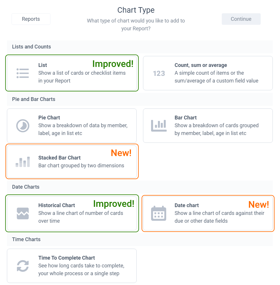
- Date charts let you chart cards against their due (or other) dates to see when work is planned in the future
- *Stacked bar charts mean you can see data in multiple dimensions. Great for seeing a breakdown of work by member and a custom field or label.
- Data breakdowns for historical charts let you see your historical data by member, label or custom field
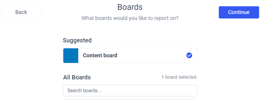
Or to show it in the reports wizard...
New data table
The changes here might be subtle but they were the most highly requested changes to the reports by some distance. Nothing too clever to demo, but you can now resize and rearrange your table columns.

This works in all the data tables throughout the app. Changes are saved to the report or quick list and will be used for all users.
Due (and other) date charts
Create charts showing cards based on their due dates, start dates (see below!) or any custom date fields. This is great for resource planning into the future and checking your team workload going forward.
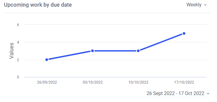
Not only can you show cards based on their future due dates you can also group the chart by member, label or anything else you would expect. Great for seeing not just what work is planned but who it is assigned to.
You can create these charts from the wizard by selecting the date chart option. We have written a short help doc here.
Stacked bar charts
Stacked bar charts let you create a normal bar chart, broken down by label, member, list or custom field, then break each bar down by another grouping. For example, you can create a chart showing which lists cards are in, then further break that down by member to see who has work assigned at each stage.
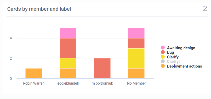
To create a stacked bar chart just choose the stacked bar chart option from the wizard. Check out the help doc here for more details.
Data breakdown for historical charts
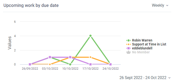
Historical charts can finally show more than one line of data. So you can compare members, custom fields, etc on a single historical chart. As you can see below, you can click on the legend to toggle individual data series.
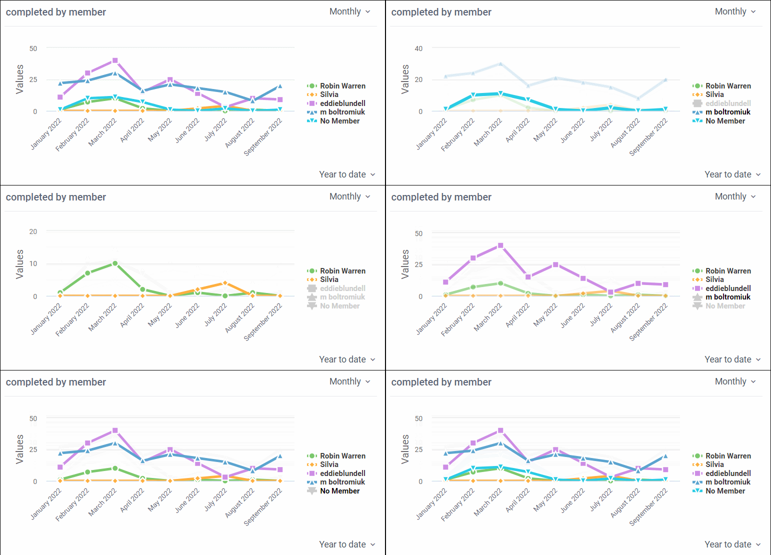
To create these charts simply create a historical chart in the wizard and select the desired option at the data breakdown step in the wizard, just as you would for a pie or bar chart. You can see the help doc here.
What's next?
Now that this work is out we are going to work on some smaller changes across a few different pups. We have some ideas on what big changes might be next but we won't make a decision on that for a month or so. As always, please get in touch if there is something you are particularly keen on us doing 😺
Check out all the above from Blue Cat Reports in Trello or add the power-up here
