Project (or Release) burnup charts for your Trello projects
I'm excited to announce the latest big addition to Corrello - Project (or Release) Burnup charts.
This is a new chart in Corrello which tracks to the total work in a project over time vs how much of that work has been completed.
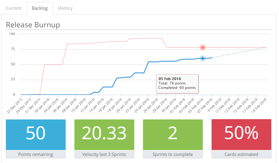
The release burnup chart shows you three lines
- The red 'total effort' line plotting how much work has been in the release over time.
- The blue 'completed' line showing how much of that work has been done.
- The dashed blue 'forecast' line showing when you will be complete assuming your current velocity is maintained.
The total effort line is useful to visualise the impact of scope changes. If you've had to agree a load of new work as part of a project, this can be a nice way to show the impact of that on the schedule. The blue line then burns up towards that total as cards are completed over time and the dashed forecast line shows how things are expected to progress.
You also get some stats on how much work is remaining, your recent velocity, how long it will take to complete the work and how much of the work has been estimated. You can also drill down and see the individual remaining cards along with estimates of when they are likely to get done.
These charts can be enabled for any of your dashboards right now. If you have a Corrello account you can login here. If you don't you can start a free trial here.