How we built the Trello Annual Report Power-Up
Our #TrelloAnnualReport is a marketing campaign we run annually, inspired by Spotify Wrapped
The campaign centres on a report we generate for teams based on activity from the Trello Boards over the previous 12 months. The results are sent as an email and available within Trello, we then follow up with some additional emails asking people to try out our paid Blue Cat Reports Power-Up.
Tech
There a a few key challenges we needed to solve when building the annual report
- Processing the historical data from Trello
- Making the data shareable without exposing data people didn't want to share
- Generating the images for the reports
Processing the historical data from Trello
Luckily for #1 we had a pretty good understanding of how to load and report on data from Trello thanks to the various reporting tools we had already built. We were able to repurpose code from Blue Cat Reports, with a large number of optimisations to speed things up as we didn't need the same depth of data the reports need.
Making the data shareable
Making it easy for users to share their reports could be very simple, but when you want a simple UX for sharing while at the same time not just making everyone's data public it gets more complex.
The simple approach would be to let people share their data on a URL using the id of their report to control which data is shown on the page. Something like /reports/1, /reports/2 etc. The problem here is that people can then easily guess those URLs to access other peoples data. You could require authentication on those endpoints, or let people control if their report is public or not. We thought either of those approaches would be too much overhead for what is really just some fun stats for the end of the year.
The solution was to embed the data for each report in the URL it is loaded from. That means we generate the image and report URLs for people from their data and make sure those URLs are only visible to them when authenticated in Trello or in the emails we send them. If they share an URL anyone who opens it can then see their data, but anyone just guessing URLs would just be shown whatever data they had put into their guessed URL.
Generating the images
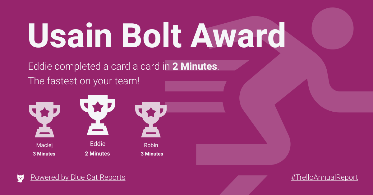
Thanks to the above images are now generated on the fly when a request is received on our server. Each image is created from a template image which we then add some text and numbers to.
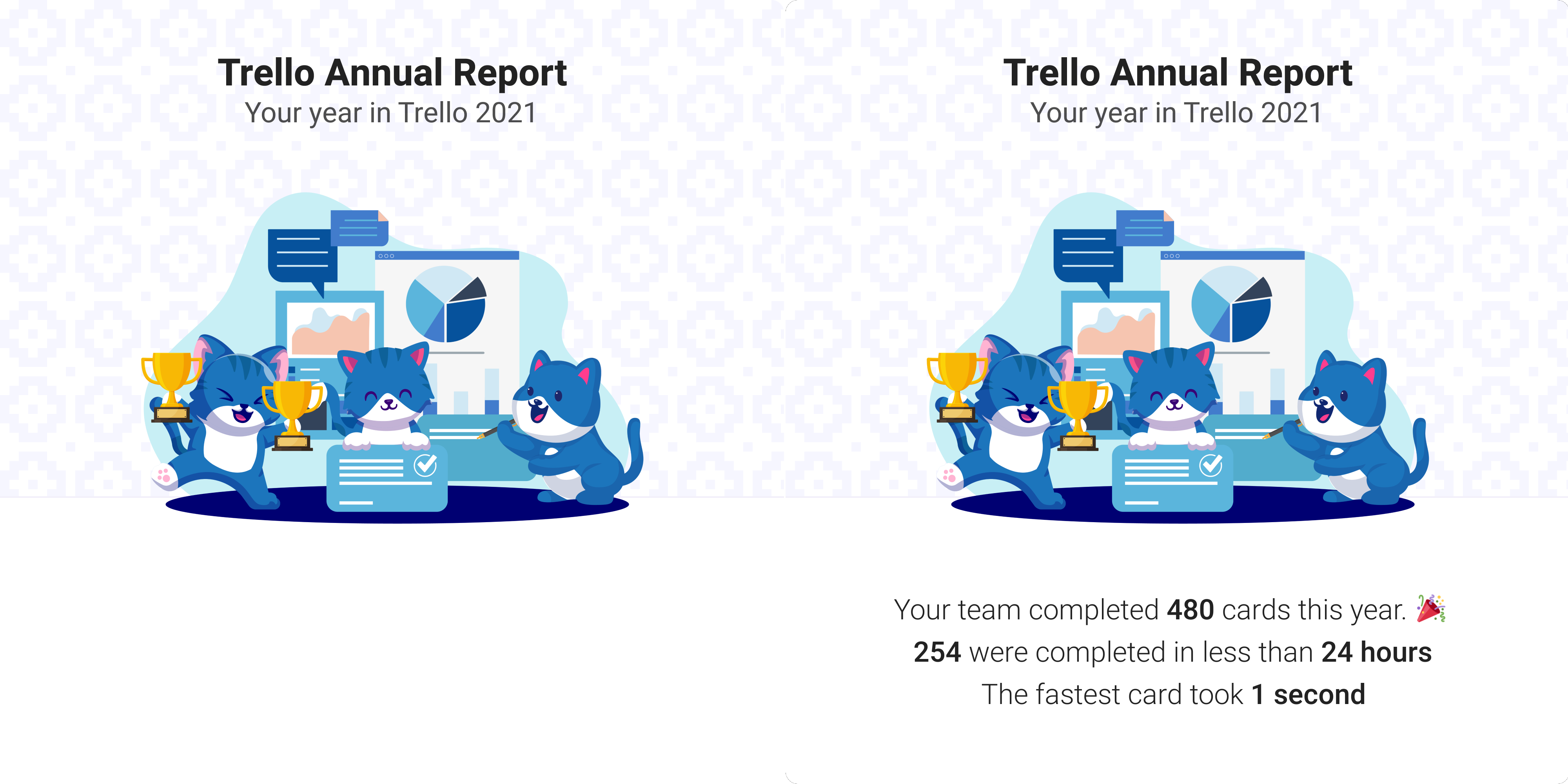
The generated images are cached to avoid load on the server if the same image is requested multiple times, and to speed up loading of the images for future users. We also built mini sites for each image, this made sharing easier as someone sharing the url of the mini site for that image would automatically get the image embedded in their tweet. This makes sharing the images a single click effort, rather than them having to download the image, then upload it onto their social media.
Design
To make generating the final images simpler we settled on just one layout for how the data was written onto the images, with different template images and text being written to them.
Depending on your aims you should consider the dimensions of your generated images. Although our 1:1 ratio images work well when uploaded to twitter, they may not suit other social networks. The most common supported ratio seems to be 1.91:1, if you want a quick place to start then just go with that.
In terms of imagery on your generated images it makes sense to keep things simple. Although we went for full illustrations this year, previously we had used simpler 'watermark' style illustrations. This had the benefit that we could let the text we generated appear over the illustrations without it looking wrong.
Another approach is to use just a few simple icons alongside your own branding. Duolingo use this to good effect here:

Email marketing
All the above is of little value if you don't actually use it for some marketing! We send 3 emails to people signing up for the Annual Report. The first is the report email, generated shortly after they configure the tool. This includes a short promotion for Blue Cat Reports at the bottom of the email.
We then send another 2 emails over the following 4 days. We are already using a tool called Userlist onboarding emails (If you are interested in the topic, they have some great content around user onboarding for SaaS on their blog :) ).
These two emails are all about trying to show the value of Blue Cat Reports and making a simple offer for people to have a free trial or take a look at some further details on how Blue Cat Reports is used by teams like theirs.
Getting feedback from our users so we can improve the product
Once we had launched we wanted to gather feedback from people using this free tool, maybe there were things they could suggest we add for next year? Or in a worst case, they could report bugs or other issues with the reports we were generating. We decided to add Saber Feedback to every report. This allowed us to gather feedback from people on every step of the process as well as the final reports.
Conclusion
That about wraps it up. I just wanted to get a quick post down about how we tackled some of the issues around building a tool like this. If you are thinking of building something like this in 2022 it can be a fun reason to contact your users and although there are challenges your team will probably enjoy the process of building something fun like this :)